
Have you ever looked at someone’s curtains and thought, “Yikes, that does not fit the mood of this room!” Even if you haven’t, you would be surprised at how colors can affect you. When it comes to setting up a space, color psychology plays a significant role in interior design, influencing the mood, ambiance, and overall perception of a space. Understanding how different colors evoke specific emotions and behaviors is essential for creating harmonious and aesthetically pleasing environments. Today, we will explore the fascinating world of color psychology and its application in choosing window treatments to enhance the atmosphere of your home.
Color Psychology: How Colors Impact Our Emotions
Colors can remarkably influence our moods, emotions, and perceptions. Here’s a brief overview of how different colors can impact our psychological state:
Warm Colors:
Red: Often associated with passion, energy, and excitement, red can evoke strong emotions and stimulate conversation. It’s a bold choice for areas where you want to create a lively and vibrant atmosphere.
Orange: Symbolizing creativity, enthusiasm, and vitality, orange is a warm and energetic color. It can add warmth and liveliness to a room, making it an excellent choice for creative spaces or areas where you want to promote positivity and energy.
Yellow: Representing happiness, optimism, and cheerfulness, yellow is a bright and uplifting color. It can bring warmth and positivity to a space, making it ideal for areas where you want to create a welcoming and vibrant atmosphere.
Cool Colors:
Green: Symbolizing nature, growth, and harmony, green has a soothing and rejuvenating effect. It can create a sense of balance and tranquility, making it ideal for areas where you want to promote relaxation and connection with the outdoors.
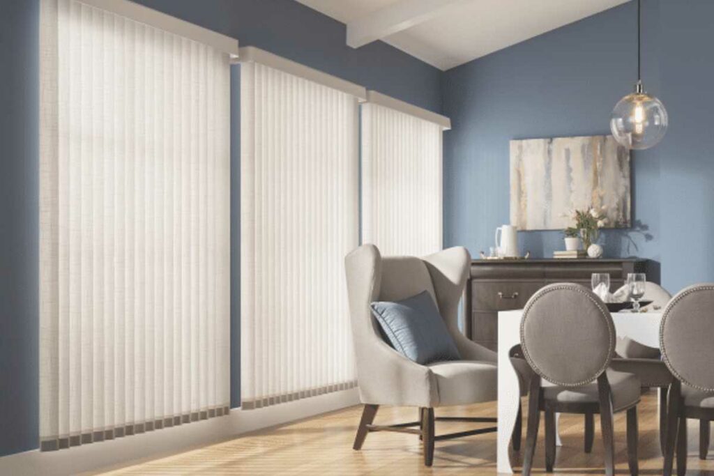
Blue: Known for its calming and serene qualities, blue is often associated with tranquility, relaxation, and stability. It’s a popular choice for areas where you want to promote peace and calmness.
Purple: Associated with luxury, creativity, and spirituality, purple can evoke a sense of elegance and sophistication. It’s often used in spaces to create a serene and tranquil atmosphere.
Tips for Choosing Window Treatment Colors
Selecting the right colors for your window treatments begins by considering the room’s function. You want the energy and function of the room to connect with the color. Here is what we recommend:
Living Room or Social Spaces:
For areas where socializing and entertainment occur, consider warm and inviting colors such as shades of red, orange, or yellow. These colors can stimulate conversation and create a lively atmosphere.
Alternatively, earthy tones like beige, taupe, or warm browns can promote relaxation and comfort, making them ideal for cozying up in the living room.
Bedroom or Relaxation Areas:
Bedrooms are spaces dedicated to rest, so opt for calming and soothing colors like soft blues, greens, or lavender. These colors can promote tranquility and help create a peaceful environment conducive to sleep.
We advise avoiding overly stimulating colors like bright red or vibrant yellow, as they may interfere with relaxation and sleep.
Home Office or Study Spaces:
In home offices or study areas where focus and productivity are key, choose colors that promote concentration and mental clarity. Neutral shades like gray, beige, or white can create a clean and organized environment, while subtle pops of color can add interest without being distracting. Consider hints of green to add a sense of nature when trapped inside for long periods.
Children’s Rooms or Play Areas:
Children’s rooms and play areas are spaces for fun and creativity, so feel free to experiment with vibrant and playful colors. Bright shades of yellow, blue, or pink can stimulate imagination and create a cheerful and lively atmosphere.
Additionally, consider incorporating patterns or prints featuring their favorite characters or themes to personalize the space and make it feel special.
Exploring Harmony of Color Psychology and Design Impact
Now, let’s dive into the art of color harmony in window treatments, exploring perception, balance, and design impact.
Perception of Space: Light vs. Dark Colors
Choosing between light and dark colors for your window treatments can significantly impact the perception of space within a room. Light colors, such as whites, creams, and pastels, reflect more light and create an illusion of openness and airiness. They can make a room feel larger and more expansive, ideal for smaller rooms or areas with limited natural light.
On the other hand, dark colors like deep blues, rich browns, and charcoal grays absorb more light and can make a space feel cozier and more intimate. While dark colors can add warmth and drama to a room, they may also make it appear smaller and more enclosed.
Creating Balance with Complementary Colors
Complementary colors are pairs of colors opposite each other on the color wheel. They create contrast and visual interest when used together, making each color appear more vibrant.
For example, pairing blue window treatments with accents of orange or yellow can create a visually striking and balanced look. Incorporating complementary colors into your window treatments and decor allows you to add depth and dimension to your space while creating a sense of harmony and balance.
The Magic of Analogous Color Schemes

Opposite to complementary color schemes, analogous color schemes, derived from colors adjacent to each other on the color wheel, offer a seamless blend of tones, promoting a sense of harmony and cohesion in interior design. These schemes evoke a tranquil ambiance, making them ideal for creating soothing and balanced living spaces.
Elevate Your Home with Perfect Window Treatments
At Blind Guy of Tri-Cities, we offer a comprehensive consultation to help you discover the perfect window treatments that complement your home’s mood and style. With our extensive range of options from top brands like Hunter Douglas, Alta, Graber, Insolroll, Sunesta, and Sun Control, you’ll find a variety of colors and textures to suit various moods and styles. Whether you’re seeking calming blues, energizing yellows, or sophisticated neutrals, we have the perfect solution for you.
Discover the perfect window treatments to complement your home’s mood and style. Contact Blind Guy of Tri-Cities for a consultation and bring the power of color psychology into your home today!